We believe colour is not just decoration - it’s communication.
The right colour scheme can instantly convey your brand’s personality, builds and engages with users, and create immediate long term recognition. On the other hand, poor colour choices can make even the best websites feel unprofessional or not welcoming.
In this blog, our design experts share a practical guide to choosing the perfect colour palette for your website.
1. Start with Your Brand Identity
Before selecting colours, define what your brand represents.
Ask yourself:
What emotions should users feel when they visit my website?
- Is my brand bold, elegant, playful, or minimal?
- What makes my brand different from competitors?
We often use strong, confident colours like red to represent passion, creativity, and energy—qualities that define our approach to design.
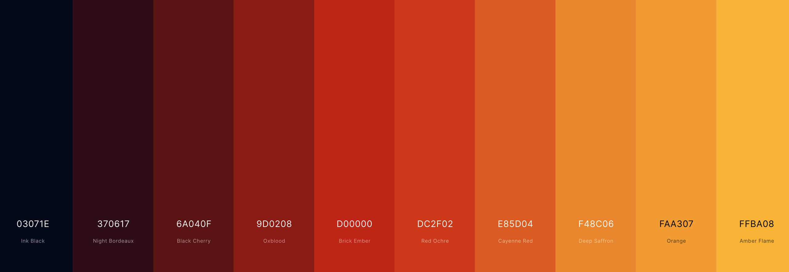
Common Colour Meanings - It's common knowledge now
- Red – Energy, passion, confidence
- Blue – Trust, reliability, professionalism
- Green – Growth, wellness, sustainability
- Black – Luxury, sophistication
- Yellow – Optimism, warmth, creativity
Choose colours that authentically reflect your brand story.
2. Your Target Customers
A successful colour palette speaks directly to the people you want to reach.
Consider:
- Age group and profession
- Cultural background
- Industry expectations
For example, a tech startup may benefit from cool, modern tones, while a creative brand can embrace vibrant, bold colours. We tailor every palette to align with both the brand and its audience.
3. Pick a Strong Primary Colour
Your primary colour is the foundation of your website’s visual identity. It’s often used in:
- Logos
- Headers
- Call-to-action buttons
For many brands, red works as a powerful primary colour when balanced with clean neutrals. The key is moderation - your primary colour should lead, not overwhelm.
4. Build a Balanced Colour Scheme
Once the primary colour is chosen, expand your palette using a proven colour scheme:
- Monochromatic – Clean and minimal
- Analogous – Smooth and harmonious
- Complementary – Bold and eye-catching
- Triadic – Energetic yet balanced
At Red Chilli Design, we usually recommend 2–3 main colours, supported by neutral shades, for a clean and professional look.
5. Use Neutral Colours Strategically
Neutral colours bring balance and clarity to your design.
Use shades like:
- White or off-white for backgrounds
- Grey for text and secondary elements
- Black for emphasis and contrast
This approach allows your brand colours - like Red Chilli Design’s signature red - to stand out without overwhelming the user.
6. Focus on Readability and Accessibility
A great colour palette must be usable by everyone.
Ensure:
- High contrast between text and background
- Clear visibility of buttons and links
- Colours are not the only indicators of important information
Accessibility is a core principle in every project at Red Chilli Design, ensuring websites are inclusive and user-friendly.
7. Get Inspired, Not Imitated
Explore competitor websites and design trends, but avoid copying. Your colour palette should help your brand stand out, not blend in.
Our designers at Red Chilli Design focus on creating unique palettes that are trend-aware but timeless.
8. Test, Review, and Refine
Before finalising your colours:
- Test it across different devices, making sure information is displayed in full effect
- Gather feedback from colleagues and even existing customers.
Even small colour adjustments can significantly improve user experience.
Final Thoughts
Choosing the right colour palette is a small but important step in building a successful website. With the right balance of creativity, psychology, and usability, your colours can elevate your brand and strengthen your digital presence.
Take a closer look at some the websites we have designed and developed https://www.redchillidesign.co.uk/web-design-bolton